9 COLORS PROVEN TO INCREASE YOUR RETAIL PROFITS
- Mar 2, 2020
- 4 min read

Color plays a huge role in our perceived quality, value, brand and lifestyle, which goes to say it’s one of the key deciding factors is your customers will buy or pass on your product. Some colors can cause a strong guttural reaction, either drawing them in or repelling them in a blink of an eye.
We gathered a list of 9 colors that promote sales based on the emotive reaction that works for your brand
WHY COLORS MATTER
Color is ubiquitous and is a source of information. People make up their minds within 90 seconds of their initial interactions with either people or products. About 62‐90 percent of the assessment is based on colors alone. So, prudent use of colors can contribute not only to differentiating products from competitors, but also to influencing moods and feelings – positively or negatively – and therefore, to attitude towards certain products.

THE COLOR WHEEL – SPECTRUM
CHOOSING THE RIGHT COLOR
In-store merchandising display programs are investments to increase brand awareness, promote products and sales as well as create an experience that connects the brands message with the buyer.
But before you agree to a display program that swathed in your brand’s colors, consider if it best used as a base color or an accent. Here are some things to consider:
Will it enhance the retail experience
Will it enhance the retail space for my retailers
How durable is the color/material
How will it look in different seasons
Does it stand out or blend in, which is better for you product/brand/retailer?
COLOR OPTIONS

How the color orange affects the retail experience
ORANGE
Attention grabbing
Energetic + Youthful
Forward thinking
Edgy + DIY + Craft
Refreshing
Heavy linked to Halloween
Orange can be a very strong and energetic color. Like yellow and red, it can be very attention-grabbing, which is perhaps why it is often used in advertising.

How the color black affects the retail experience
BLACK
Highly Versatile
Modern + Traditional
Exciting + Relaxing
Great Contrast Color
Boldness
Uphappiness
Mystery
In marketing and branding psychology, black is associated with boldness, formality, mystery, strength, luxuriousness, and seriousness.2 Famous brands that utilize black in their logos and marketing are Blackberry, Tiffany & Co., Apple, Disney, Nike, Gillette, Adidas, Sony, Ralph Lauren, and MTV. Besides being sleek, black is versatile and can be combined with any other color.

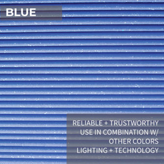
How the color blue affects the retail experience
BLUE
Reliable + Trustworthy
Use in Combination with other colors
Lighting + Technology
Productivity
Inspiration
Sadness + Calmness
While blue has different symbolic meanings, individual reactions to the color blue can vary widely. The following are some of the reactions to the color blue that readers have shared over the years.

How the color gold affects the retail experience
GOLD
Prestige + Luxury
High End
Accents
Generosity
Compassion
Success
Optimistic and positive, gold adds richness and warmth to everything with which it is associated – it illuminates and enhances other things around it.

How the color green affects the retail experience
GREEN
Versatile
Health + Natural
Use with complementary colors
Luck + Safety + Envy
Calming + Exciting
Compassion
Because the color green is so associated with nature, people often describe it as natural, fresh, and restful. However, it is important to remember that all reactions to color are also shaped by cultural influences and individual experiences.

How the color pink affects the retail experience
PINK
Young + Feminine
Energetic + Fun + Joyful
Great Contrast Color
Romance
Kindness
Creative
Pink is thought to have a calming effect. One shade known as “drunk-tank pink” is sometimes used in prisons to calm inmates. Sports teams sometimes paint the opposing team’s locker room pink to keep the players passive and less energetic.

How the color gold affects the retail experience
PURPLE
Elegance + Luxury + Quality
Health + Beauty
Exotic
Wisdom
Mystery
People often describe this color as mysterious, spiritual, and imaginative. Purple tends to occur rarely in nature, so it is viewed as rare and intriguing.

How the color red affects the retail experience
RED
Attention Grabbing
Dramatic + Powerful
Most Popular color in retail
SALE SALE SALE
Passion + Love + Anger
Some people report finding red fun and playful, while others feel it is too bold, exciting, or even sexy. Avoid use in large color blocks as it can be intimidating

How the color yellow affects the retail experience
YELLOW
Attention Grabbing
Powerful but Risky
Use as bold pops of color
Avoid Muted Tones unless its on brand
Bright + Intense
Difficult to Read
It is often used in situations and products intended to create a sense of excitement or energy. It is bright and immediately grabs the eye. It can seem fresh, intense, overwhelming, or even brash and forceful in its energy.
CONCLUSION
Selecting the right color can be fun yet challenging, especially when trying to evoke the right reaction from your customers.
It’s worth taking a field trip to your retailers to see what works in their space and also what doesn’t. When you’re picking up groceries or that last minute gift for a coworker’s baby shower, see what colors stand out to you and ask yourself why.

Once you select the color, it’s also important to know what materials/production methods are available for your next project. We work with every color + material combination available and will be happy to explore them with you.
Contact us to discuss your project.
So, it’s time to get the process started!


Comments