5 Tips for Making Great Freestanding Displays
- Apr 22
- 4 min read
That Actually Get Placed (and Sell)
Walk into a major retailer like Target or The Home Depot and you’ll notice something fast. The question is... will you stop or just walk past?
The displays that perform aren’t just “nice looking.” They’re doing a job. They stop you mid-aisle, make the product instantly understandable, and guide you to a decision in seconds. Meanwhile, a few feet away, another display with similar products gets ignored completely.
In this post, you’ll get five practical, field-tested tips to design freestanding displays that get approved, get placed, and actually move product.
1. Know Your Footprint Before You Design Anything
Retail is not forgiving when it comes to space. Every inch is planned. Before you design, you need to understand exactly where your display is going. Endcap? Power aisle? Inline? Each has different dimensional constraints.

If you don’t have a retailer locked in, design for flexibility. A 24" to 36" width with a controlled depth is often the sweet spot for broader placement opportunities. Even better, build modularity into the design so it can scale up or down depending on the environment.
Learn about Benchmarc's modular advantage here: https://www.benchmarcretail.com/post/the-modular-advantage
The easier it is for a retail buyer to visualize your display fitting into their floor plan, the faster you move from concept to placement.
2. Define the Job: Merchandising, Marketing, or Both
Not every display needs to do everything. In fact, trying to do too much is a fast way to dilute performance.
Picture a freestanding display for a premium haircare brand. It has strong product capacity, but it’s also loaded with messaging, lifestyle imagery, and educational content. Sounds good in theory. In reality, the shopper doesn’t know where to look first.

Now compare that to a cleaner execution. The top third is dedicated to a bold brand statement and one clear benefit. The middle is focused on hero SKUs with strong visibility. The bottom holds backstock. Simple. Clear. Effective.
Decide upfront: what is this display meant to do?
Merchandising-first displays prioritize product density, accessibility, and replenishment
Marketing-first displays prioritize storytelling, visuals, and brand engagement
Hybrid displays require strict hierarchy so one function doesn’t compete with the other
If a shopper has to pause and figure out what your display is about, you’ve already lost them.
3. Build a Planogram That Makes Shopping Effortless
Retailers think in planograms. If you don’t, you’re already behind.

Let’s say you’re launching a line of supplements. You have 8 SKUs. Without a planogram, they get placed randomly. The result is visual noise and slow decision-making.
Now imagine a structured approach:
Top shelf: best sellers with “Top Rated” callouts
Middle shelves: category groupings like Energy, Sleep, Immunity
Bottom shelf: bulk sizes or value packs
Add clear shelf talkers and consistent spacing. Suddenly, the display becomes intuitive.
A strong planogram does three things:
Maximizes visibility of key SKUs
Simplifies the shopping journey
Signals to the retailer that you’ve thought through execution
Retailers want to know exactly how your display will look on day one and how it will be maintained over time. The more clarity you provide, the more confidence you build.
4. Prioritize Strength and Balance
Imagine a freestanding display loaded with bottled beverages. It looks great when empty. Once fully stocked, it starts to bow slightly in the middle. Customers lean on it. A cart bumps into it. Now it’s swaying.
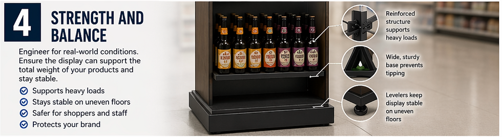
That’s not just a design flaw. That’s a liability.
Freestanding displays need to be engineered for worst-case scenarios, not best-case ones. That means:
Calculating total product weight across all shelves
Reinforcing load-bearing areas
Designing a base that prevents tipping or shifting
A slightly heavier, more stable base is almost always worth the cost. Retailers notice when a display feels solid. They also notice when it doesn’t.
If store staff don’t trust it, they won’t keep it on the floor.
5. Use Accessories to Increase Functionality and Flexibility
This is where good displays become great ones.

Accessories like hooks, pegs, shelves, and adjustable slots allow you to adapt the display to different product types and packaging formats. That flexibility can extend the life of the program and make it more appealing to retailers.
Now think about mobility. Adding hidden casters can allow store teams to reposition the display quickly for seasonal resets or cleaning.
Lighting is another unlock. Even a subtle LED strip can draw attention to premium products and create contrast in a crowded aisle.
The key is intentionality. Every accessory should solve a problem or add value. Otherwise, it’s just clutter.
The best freestanding displays don’t happen by accident.
They’re designed with the retailer, the store environment, and the shopper in mind from the very beginning.
And performance is what gets you reorders, expanded placements, and long-term retail partnerships.
If you’re developing a new display program and want to pressure-test your concept before it hits production, Benchmarc Display can help you refine, engineer, and execute it so it works where it matters most: on the retail floor.


Comments